Unify
Unify shows when your friends are free at the same time as you, so meeting up between classes no longer takes a group chat.
The problem
1My friends and I study different subjects. We share a campus but rarely a course, so every week we swapped screenshots of our timetables to find a time to meet. When a few of us kept track for a week, arranging a half-hour coffee took around 20 minutes of texting, and about a third of the plans never happened.
A quick survey · 30 students at our uni
26 of the 30 students we asked never meet a friend from another course between classes
Why the 21 gave up
I went back to nine of them. Not one said they didn't want to meet. It simply costs more than it is worth: "I'd meet them if I knew when, but working it out takes longer than the break." Finding out whether your friends are free is the work, and the break is over by the time you have.
The second thing was the size of the window: "By the time everyone has answered, I'm already in the next lecture." For forty minutes it isn't worth the back and forth, and as one of them put it, "we say next week, and next week never comes."
The constraints
2Before I designed anything, the research set three constraints:
It had to answer inside the break, not after it. The window was the constraint, not willingness.
It had to work across faculties. 20 of the 30 have a close friend outside their own course, so a shared course timetable doesn't help them.
It had to cost nothing to check. The 21 who gave up still wanted to meet; checking cost more than the break was worth.
The idea
3Who's free now
I wanted two ways into the same overlap instead of one screen doing both jobs. Connect now is the glance: who is free right now and until when, before you have typed anything. Tap open Timetable and it opens into the full week, with everyone's timetable side by side, for the questions a glance can't answer.


To find the overlap, Unify reads the gaps between everyone's timetables, keeps only the stretches every friend has free, drops anything under 20 minutes and takes the walk between buildings off both ends. The group chat used to do this by eye.
The pivot
4I designed the first version in blue, with typewriter type and hard lines. The structure worked; only the look was about to change.
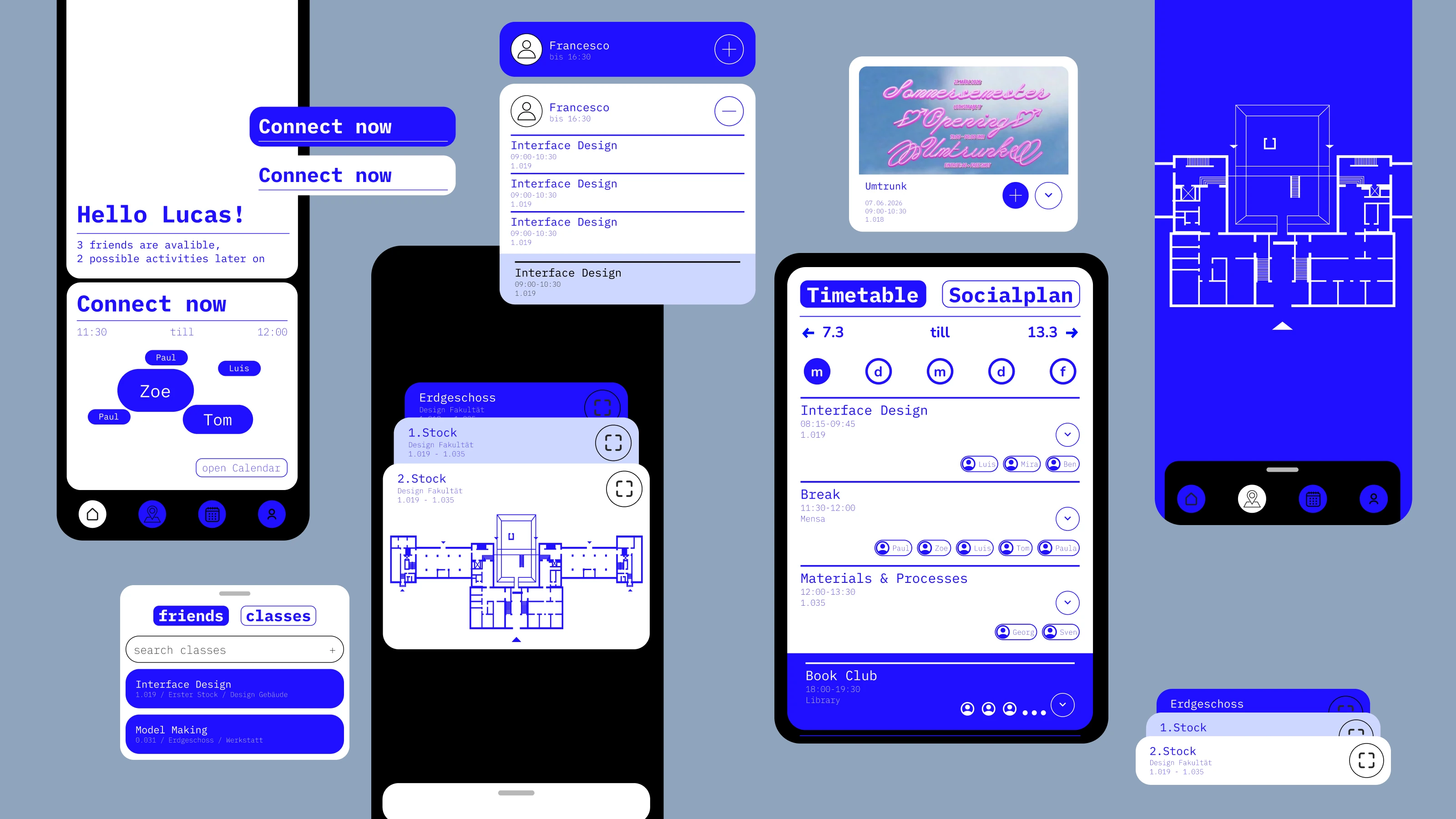
It felt like a tool
It was clear and structured, but the team's feedback said the same thing back: it wasn't really a chill university vibe, especially for a design faculty. So the look was replaced.
What replaced it
The answer to "it feels like a tool" wasn't a nicer blue. Sophie and Moritz drew a cast of characters and built the palette and type around them: a pink you rarely see in an app , a warm off-white behind it , and Nunito's rounded letterforms instead of typewriter type. The characters also appear in the interface itself, on the map bar, the mode toggle and the empty states, so a friend becomes a shape you recognise instead of a name you read. The structure underneath generally stayed the same.
The final design
5
Your Timetable, and Everyone's
See your own timetable next to your friends' and who shares each course. Your schedule splits in two: pink for courses, beige for social activities you add from Socials. Your friends' timetables sit below. Location tracking detects when you're in the building and lights up your current room in green.
Beyond the Group Chat
Every uni has a group chat where events get buried under hundreds of messages. Socials replaces it: activities get posted here, so nothing slips through. Scroll through the week and add what appeals to you to your timetable in one tap. This part stayed a concept, since it only makes sense with far more users than the pilot had.
Find Your Friends Indoors
Apps like Find My work until everyone is in the same building and the map stops being useful. Unify syncs room-level location with the university's floor plans, so you see exactly who is around you, or search for someone from the menu.
Find the Right Room
The same idea for your courses. Universities have hundreds of rooms across sprawling buildings, and finding your class can be overwhelming, especially when you're new. Unify syncs with your timetable and plots every course room on the map. Tap one to see the details of that class.
A glance is usually enough
We built the timetable, socials and map as full screens first. Using them, we noticed that most of the time nobody needs a friend's whole week, only who is free right now. Socials was the same: you rarely scroll the full list, you just want to know what's on today. So the home screen became three summary cards, each showing only the most important piece of its feature.
A preview pulls you in
The summaries also pull people into the screens behind them. A YouTube video that plays a few seconds of itself in the feed gets clicked more than a still thumbnail, and the cards work the same way. Who's free, what's on and who's nearby all sit on the first screen, so each card invites you to open the full feature behind it.
Testing and results
6Five friend groups, twenty students in all and mostly people we knew, used the coded prototype for three weeks. It was a small test, so the numbers below show a direction rather than prove anything. They come from what the app logged and from short interviews at the end.
One part could not be tested: the social plan, the activities you add to your timetable. It only makes sense with many more users than a pilot of twenty and would need testing at a much larger scale, so it remained a concept.
Where the time went
Once the home screen was in, roughly seven in ten minutes in the app went to "who's free now". The full timetable, the friends map and the room map split the rest. Asked at the end, people said they met up about three times a week between classes, up from once or twice before.
Before and after the home screen
In week one the prototype opened straight onto the timetable. The home screen arrived for weeks two and three, and people opened Unify more often after that. The map, barely touched in week one, roughly doubled, mostly opened straight from its card. With twenty people and a novelty effect in week one, that is a hint, not a finding.
What we learned
7Most of the time in the app went to a single block on the home screen, while the indoor map, the hardest part to build, barely registered. The summary of all three features turned out to be where people actually spent their time.
A visual language is not decoration. My v1 was clear, structured and cold, and the feedback round said so politely: it looked like something the university had issued. The same screens in the character design read as the group's own, and the structure underneath stayed largely the same.
Next I would build widgets, so the free-now block never needs the app opened, and test it with more than twenty people, ideally outside our own circle of friends.